Reading
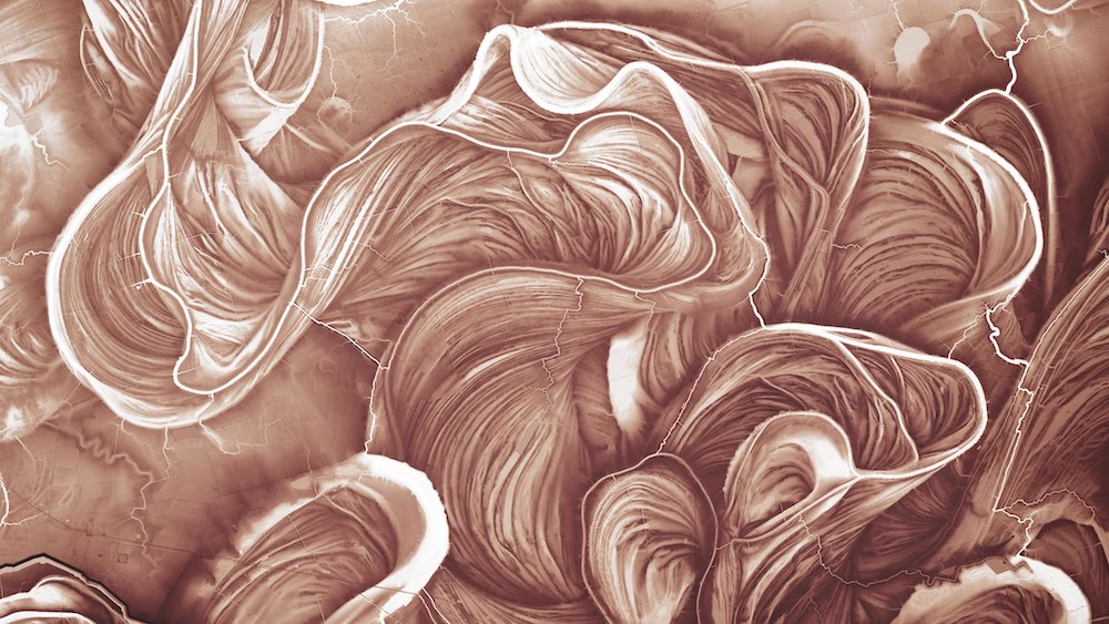
The Mississippi River’s hidden history, uncovered by lasers. Love these images from Daniel Coe.
The article is about his work to put a contemporary slant on the Mississippi River meander maps made by Harold Fisk in the 1940s, which I’ve long been a fan of (I actually have one up on a wall at home; they’re stunning pieces of technical art, and a great reminder of an epic trip).
Fisk had to make use of whatever tools were around at the time – mostly aerial photos – yet when you compare his with the modern versions, they’re unerringly accurate.
The lasers detect the river’s shape along with everything around it—every house, tree, and road. Strip away these layers of vegetation and human add-ons, and Coe’s maps show the river’s bare-ground geomorphology: once lazy bends replaced by direct flow, old floodplains cut off by levees and dikes.
Watching
This presentation about Responsive Typography by Mandy Michael (via JAMstack Conf). I’ve yet to try variable fonts myself, but that video (and the various examples she’s put together on codepen) make me want to give it a go. Note to self: https://v-fonts.com/
Variable Fonts allow typography on the web to adapt to the flexible nature of screens, environments and devices. We can use variable fonts with pre-existing technologies to improve the performance, design, accessibility and usability of our websites. We can start to design our typography to adjust to various inputs, situations or events using Media Queries, JS events and the Sensor or Audio Apis.
Being printed in
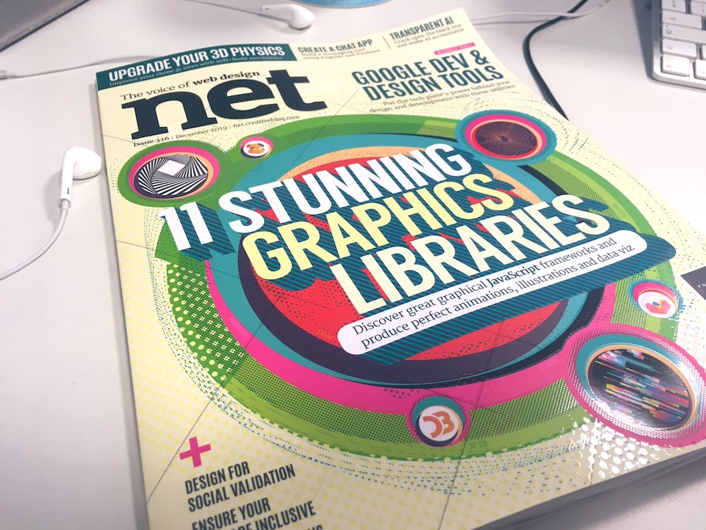
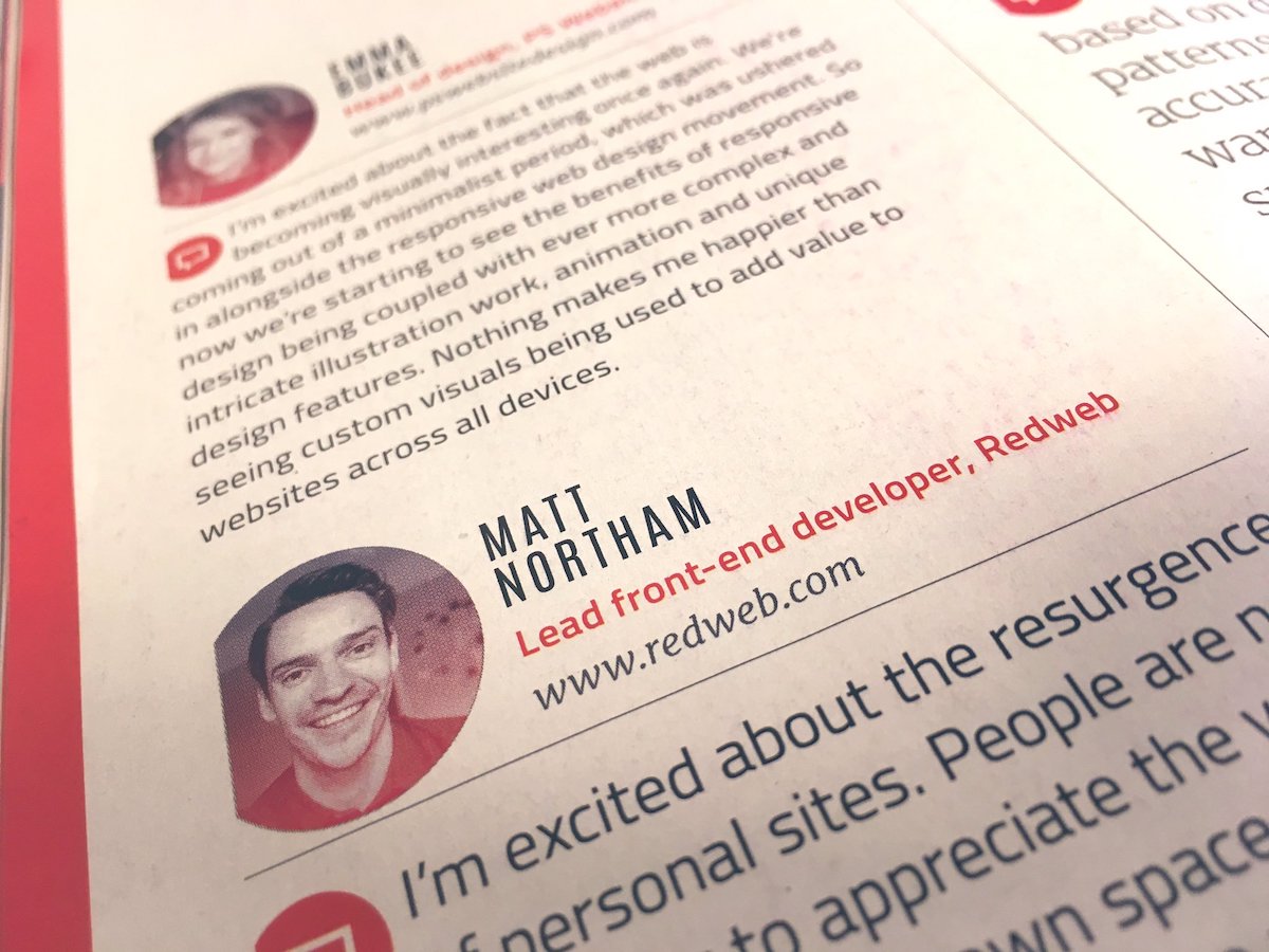
The latest edition of net magazine, with a bit of blurb about what excites me about the web today (* spoiler, it’s “personal sites”). Due to space and whatnot, they did cut a couple of sentences about IndieWeb, but the gist is still there. Second time in netmag this year; living the dream.